Jaipur Kurti,redrawn.
Jaipur Kurti sells kurtas, kurta sets and sarees online and in 250+ stores, including Shoppers Stop, Reliance Trends and Centro. The brand and the photography are strong. The store around them makes shoppers work: a very heavy homepage, the same styles repeated, and no help choosing a size. This is what we found, and a working rebuild you can click through below.
Independent concept. Not affiliated with or endorsed by Jaipur Kurti.
- Brand
- Jaipur Kurti
- Sector
- Fashion · D2C e-commerce
- Reviewed
- 7 Oct 2026
- Rebuilt
- Home + product page
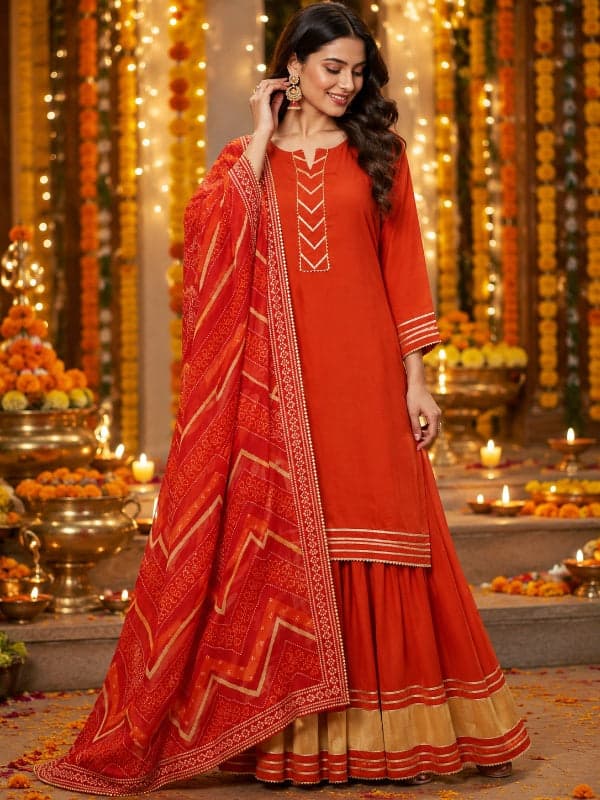
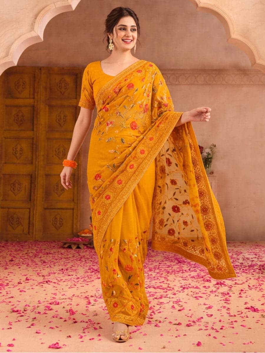
The homepage, before and after
- Images on the homepageToday382Concept42
- Scripts loadedToday80Concept2
- Page elements (DOM)Today7,744Concept720
- Product links to 88 productsToday893Concept35Concept links 14 products
- Images with no alt attributeToday12Concept0
- Social share imageTodayNoneConceptSet
- Page heading (H1)Today“jaipurkurti”ConceptDescriptive
One browser session, 7 Oct 2026. Home page only.
Now click around it.
The rebuilt home page and product page, running live. It uses the brand’s own products and photos. Checkout is the next build.
Live, interactive · Jaipur Kurti, concept rebuild
Scroll inside the frame. Add something to the bag, filter the grid, open a product, check a pincode.
What we found
Five things we would fix first, in the order they cost the brand.
- → 01
The homepage is the whole catalogue
What we found
One page loads 382 images, 80 scripts and about 7,700 page elements. Product carousels repeat, so 88 products are linked 893 times.
Why it matters
Most of this audience shops on a phone. A page that heavy is slow to become usable and hard to scroll, and every repeat of a product is a place to get lost.
What we did
Five category tiles, one picks rail and one filterable grid that shows eight products and loads more on request. Images load as you reach them. The whole page ships as a small bundle with no extra apps.
- → 02
Choosing a size is guesswork
What we found
On the homepage, cards say “Choose options” and list sizes as plain text rather than as something you can pick. We only reviewed the homepage, so we have not judged their product page.
Why it matters
Fit uncertainty is the main reason people hesitate to buy clothes online, and the main reason they return them.
What we did
Tappable size chips with sold-out sizes crossed out, quick add straight from the card, a size guide, a pincode check for delivery and cash on delivery, and a sticky add-to-bag bar on phones.
- → 03
Trust sits in a banner, not near the price
What we found
The retail credentials (Shoppers Stop, Reliance Trends, Centro, 250+ stores) live in the top banner. Cards show no ratings. Discount badges run from about 40% to 74% on almost every card.
Why it matters
Being in 250 stores is a rare advantage for an online brand, but it is not doing any work where the buying decision happens. Constant very deep discounts also read as a list price nobody pays.
What we did
A trust bar under the hero, a partner-store strip, a store finder by city, review slots on cards and product pages, and returns, shipping and COD next to the price. We kept their real prices. The list-price strategy is a conversation to have with the brand.
- → 04
Search and sharing leave value behind
What we found
The page heading is the lowercase brand name. No social share image is set, so links shared on WhatsApp and Instagram show no preview picture. 12 images have no alt attribute. To their credit, the canonical URL, structured data and mobile viewport are in place.
Why it matters
Shared links are how fashion spreads. A plain heading and missing image text also give search engines less to work with.
What we did
A descriptive heading, a share image and per-page titles, Product structured data with price and rating, and an alt attribute on every image.
- → 05
Built to be used with a keyboard and a thumb
What we found
This was a visual review, not a full accessibility audit. The pale gold section headings looked low in contrast against the cream background.
Why it matters
Contrast, focus and tap size decide whether everyone can use the store, and they are cheap to get right at the start.
What we did
Skip link, keyboard-operable bag and menus, visible focus, labelled controls, 44px touch targets and reduced-motion support throughout.
What comes next
This is a first pass. Here is how it becomes the real thing.
- 01
Checkout and payments
The bag works. Checkout, UPI, cards and COD are the next build.
- 02
Live catalogue
Connect to their store so products, prices and stock stay in sync.
- 03
Real reviews and ratings
Replace the sample rating slots with a reviews provider.
- 04
Store finder with real locations
Swap the sample city list for their actual store data.
- 05
Prerendered pages and analytics
So search engines see every product page, plus an A/B test plan for the first 90 days.
How to read this
- Measured on the live homepage and on the concept on 7 Oct 2026, in one browser session. Load times are not compared, because the live site is served from the internet and the concept from a local build.
- The concept uses Jaipur Kurti’s real product names, prices, sizes and photography. The ratings, reviews, size chart and store list in the concept are sample content, not their real data.
- Jaipur Kurti’s name, logo and product photography belong to Jaipur Kurti. This is an independent concept by Reeveri, not affiliated with or endorsed by the brand.
Want yours looked at?
Send us your site. We will tell you what we would change, and show you.